Showing posts with label Library Web Site. Show all posts
Showing posts with label Library Web Site. Show all posts
Wednesday, August 7, 2013
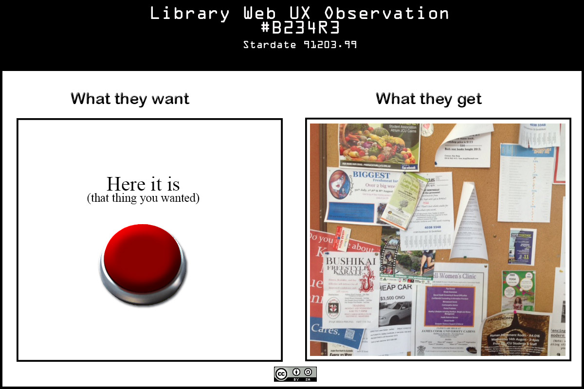
My UX Frustrations Visualised
I am turning into a cranky old man - I can only apologise to my colleagues for having to put up with my tirades. They seemed to like Steve Krug's 'Don't Make Me Think', but the home page remains a regular battleground. I know compromises have to be made - but the compromises always seem to cost the users. So to vent some steam and publicly apologise for my crankiness I resort to faux visualisation:


Thursday, July 18, 2013
Random thought: The limits of Google Analytics - it's just data, not information
I'm still wading through Google Analytics to get an idea of how the web site is used so I can have some 'evidence-based' proposals for the site home page and persistent navigation.
One thing that I'm pondering after my last blog post is referrals from Search Engines. If a page is linked to much more often from a search engine results page (SERP) than from another page in your site does that indicate your site is failing the user, or that the user prefers to use a search engine?
If a page is a common exit point does that mean it satisfied the user need, or did it just frustrate them enough to give up? Does an elongated 'time on page' mean the content engrossed the reader or that they glazed over into catatonia?
If your total page hits go up down after a redesign does that mean you lost popularity or your site is providing the required content with a lot less clicks?
I think I could argue two opposite sides to almost anything Analytics appears to hint at - each supposition on a facet of Analytics would probably make an ideal topic for a formal debate in the vein of 'can money by happiness' or 'is honesty the best policy'
The answer is site Analytics on their own are ambiguous guides to user behaviour - you really need to observe, consult and 'know' your users.
Analytics' value is in aggregating data so you can visualise behaviours that prompts you to formulate questions like WHY IS IT DOING THAT? IS THAT A GOOD THING?
If only users could be consulted in large numbers at any time that was convenient to me.
PS GA has some tables of Google Queries mapped against how often a page from your site appeared in a SERP and how often one of your pages was clicked on, referred to as CTR (Click Through Rate). It makes for interesting perusing, maybe one approach would be to interpret user goal from the search, and then see how closely the target page matched or referred to the goal. An iterative approach that would probably improve user experience over time, but it would be difficult evaluate the impact.
Analysis of that information is making me think about using Summon's Best Bets
One thing that I'm pondering after my last blog post is referrals from Search Engines. If a page is linked to much more often from a search engine results page (SERP) than from another page in your site does that indicate your site is failing the user, or that the user prefers to use a search engine?
If a page is a common exit point does that mean it satisfied the user need, or did it just frustrate them enough to give up? Does an elongated 'time on page' mean the content engrossed the reader or that they glazed over into catatonia?
If your total page hits go up down after a redesign does that mean you lost popularity or your site is providing the required content with a lot less clicks?
I think I could argue two opposite sides to almost anything Analytics appears to hint at - each supposition on a facet of Analytics would probably make an ideal topic for a formal debate in the vein of 'can money by happiness' or 'is honesty the best policy'
The answer is site Analytics on their own are ambiguous guides to user behaviour - you really need to observe, consult and 'know' your users.
Analytics' value is in aggregating data so you can visualise behaviours that prompts you to formulate questions like WHY IS IT DOING THAT? IS THAT A GOOD THING?
If only users could be consulted in large numbers at any time that was convenient to me.
PS GA has some tables of Google Queries mapped against how often a page from your site appeared in a SERP and how often one of your pages was clicked on, referred to as CTR (Click Through Rate). It makes for interesting perusing, maybe one approach would be to interpret user goal from the search, and then see how closely the target page matched or referred to the goal. An iterative approach that would probably improve user experience over time, but it would be difficult evaluate the impact.
Analysis of that information is making me think about using Summon's Best Bets
Monday, January 21, 2013
Removing Library Jargon from our Home page - what Google Analytics tells us
In January I tend to catch up on all my statistics collection for the last year - and if I can, do some cursory analysis.
I've been using Google Analytics Campaigns to track the use of links on the Library's home page - which was revamped around this time last year after usability testing with students.
After finally biting the 'less library jargon' bullet. Here are some of the changes we made and the differences in clicks between 2011 and 2012.
Interestingly in the case of Databases we restored some button navigation labelled Databases at the request of some academic staff. Hits about a third of the number of the Journal Articles link. Overall use of our static listing of databases has dropped around 5%. Rather than go straight to the A-Z listing of databases the new link lists a number or resources and tips (including the A-Z).
The focus of this phase of review/redesign was very much on undergraduates, particularly first year.
Our user testing showed confusion about article searching with significant numbers going to the eJournal portal (an A-Z listing from Serials Solutions) browsing for a likely journal title, then browsing the issues for a relevant article.
Reserve Online had users thinking it was about reserving books, and students didn't draw the link between video materials and our catalogue.
Our corporate CMS template forces us into four columns - previously the column header for these links was 'Finding Resources' - which we trimmed to 'Find' which gave some added context to the link names and hopefully amplified our goal-based approach.
Overall the bounce rate for all home page links dropped 21%, a fair indication that users are having more success in finding what they are looking for when selecting a link.
We also have a Summon search box as the default centrepiece of our home page, its use continues to grow strongly.
I've been using Google Analytics Campaigns to track the use of links on the Library's home page - which was revamped around this time last year after usability testing with students.
After finally biting the 'less library jargon' bullet. Here are some of the changes we made and the differences in clicks between 2011 and 2012.
- The Catalogue and the more meaningless Tropicat were replaced by Books, DVDs & more.
- Hits up 10%
- Bounce rate steady
- Reserve Online replaced by Readings & Past Exams.
- Hits up 100%
- Bounce rate down 25%
- Databases replaced by Journal Articles
- Hits up 90%
- Bounce rate down 60% (but meaningless as most links are to external sites in the old target page)
Interestingly in the case of Databases we restored some button navigation labelled Databases at the request of some academic staff. Hits about a third of the number of the Journal Articles link. Overall use of our static listing of databases has dropped around 5%. Rather than go straight to the A-Z listing of databases the new link lists a number or resources and tips (including the A-Z).
The focus of this phase of review/redesign was very much on undergraduates, particularly first year.
Our user testing showed confusion about article searching with significant numbers going to the eJournal portal (an A-Z listing from Serials Solutions) browsing for a likely journal title, then browsing the issues for a relevant article.
Reserve Online had users thinking it was about reserving books, and students didn't draw the link between video materials and our catalogue.
Our corporate CMS template forces us into four columns - previously the column header for these links was 'Finding Resources' - which we trimmed to 'Find' which gave some added context to the link names and hopefully amplified our goal-based approach.
Overall the bounce rate for all home page links dropped 21%, a fair indication that users are having more success in finding what they are looking for when selecting a link.
We also have a Summon search box as the default centrepiece of our home page, its use continues to grow strongly.
Thursday, July 28, 2011
Cary Gordon on Library Web Site Design and Management
In a response to a question posted to Web4lib on Library Web Site design and management by Michael Schofield, Cary Gordon from The Cherry Hill Company offered the following observations from his experiences. Reproduced with permission (Thanks Cary!).
I have been building websites and web based applications for libraries since 1994 (yipes), and I have some opinions, none of which should shock anyone. Here are a few:
1) Most library home pages are much too dense. I have worked on a few sites that started as elegant designs, then became unusable as more committees got involved.
1a) Lesson from 1: Committees are fine, but it helps to have a single person at the top who will guard the flame.
2) Landing pages should address a specific set of user needs. If you have users with conflicting or disparate needs, create separate landing pages for them.
3) There is some confusion between usability and user experience (UX).
You can have a fabulously usability standard compliant site and still deliver a terrible user experience.
4) Build your site for the users you have, not the user you would build, if you could. You know what they want. Really, you do.
4a) This is not to say that you shouldn't highlight great resources at your library, just that you should not let them get in the way of someone trying to find out when you are open.
5) Building a site that is friendlier to different kinds of devices than you think you need is probably a really good idea.
In an ideal world, we would be able to figure out what we need from logs and analytics. Unfortunately, these tools can't usually tell us about what we don't have. Likewise, if you don't have a mobile friendly site, the user agent count isn't going to reflect the amount of traffic your site would get, were it friendlier to those clients.
I think that it is a good idea, albeit sometimes disappointing, to limit the scope of a new site to what you can maintain. To me, it is better to not have a feature than to have a feature that is disused or out of date. It doesn't bode well to go to an event calendar on a library website and see that the last entry was two years ago.
I think that these items can help:
1) Commit a specific amount of dedicated staff time to maintaining your website.
2) If possible, use a content management system that is set up in such a way that contributors and editors can concentrate on content rather than code. In other words, Ruby on Rails, which is great, is probably not a viable choice unless you have strong RoR resources on staff.
3) Unless you have staff with nothing else to do, if you do not have dedicated IT staff, have your website hosted by a reliable company.
There are reliable hosting companies starting at about $10/mo, and fully managed hosting available from about $75/mo.
4) If you use a CMS or other software, invest staff time, and money, if necessary, in training, and make sure that the training is appropriate to what you are trying to accomplish.
5) Don't lock in to any more dedicated workflow than you really need or can support in practice.
I started coding sites by hand, moved to external content management systems (like Fusion), server side includes, bespoke CMS in ColdFusion and Java, and eventually to Drupal. I think that Drupal is a great solution, because it is built by its community and the strong peer support from its library user community.
Drupal is not, of course, the only solution, there being over 1,000 competing systems. As I asserted earlier, I think that most libraries should use a content management system. That would include Drupal, WordPress, SilverStripe and many others. I personally prefer free and open-source solutions to commercial products and products that have broad adoption to those that get little play. I like to look at the ratio of sales staff to programmers and support. Of course by those standards, the big ILS products look scary.
Virtual servers are an interesting topic, but I think that it is more important to broach the question of whether you plan to do your own system administration or not. We run our own data center in downtown Los Angeles (with a small branch in San Francisco), and will probably continue to do so for a while, but it seems pretty clear that eventually, it will be more economical to move this to "the cloud."
For us, this will really be a bottom line focused change, since we will still need a system administrator on staff, and we only spend a tiny amount of time on-site, with most of that devoted to equipment upgrades and replacement that we wouldn't need in the cloud.
Thanks,
Cary
Report back on latest round of usability testing
At the end of June I ran another set of Usability tests with students. The main goal was to compare the student experience six months after the first round, now that we've addressed some of the issues highlighted back then.
The full report (and the videos, session reports and other associated materials) are on the JCU Library Intranet.
What did we learn?
All the students knew how to change their passwords, almost certainly because the email changeover to Live@EDU at the start of the year required them to go to that page to test and/or change their passwords.
Now What?
Now I press on with developing a draft Information Architecture to resolve the issues identified that could not be fixed with page and link label edits. Using what we've learned from this testing, user surveys, feedback, usage stats and the Card Sorting Exercise.
The full report (and the videos, session reports and other associated materials) are on the JCU Library Intranet.
What did we learn?
- That the changes we made almost all led to improvements in the site's usability.
- On the issues where we had not yet made changes there was no significant change in performance with one exception (see The Exception below)
- Summon/One Search on the home page was used by all the testees (one used it to track down a libguide), as opposed to the previous catalogue search that was all but ignored in the first round.
- Terminology remains an issue, without successful information literacy training students don't make the mental connection between 'articles' and 'databases' and are far more likely to click on 'ejournals' to find articles on a subject. Reserve Online is still meaningless to them.
- Contacts still needs some work - task was performed with more success, but by paths not affected by our changes. Unlike the first round these testees went to the service to find the contact, unlike the first round who generally went to the generic contacts and tried to find those related to the service.
- Libguides seems to be accepted and utilised by students
- Remote access is still initiated by students as a separate process
- The form task (make a suggestion for purchase) once again displayed a 100% fail rate.
- That the DIY usability testing methodology has been validated as a method for identifying problems and measuring the effectiveness of our solutions.
All the students knew how to change their passwords, almost certainly because the email changeover to Live@EDU at the start of the year required them to go to that page to test and/or change their passwords.
Now What?
Now I press on with developing a draft Information Architecture to resolve the issues identified that could not be fixed with page and link label edits. Using what we've learned from this testing, user surveys, feedback, usage stats and the Card Sorting Exercise.
My first card sort
I carried out my first Card Sorting Exercise ever! The full report describes the process and lists what we learned and more issues we should consider in light of that. All the related documentation is available on the JCU Library Intranet.
The main points are:
I was struck too by the quantity of services we are providing and that many had no real relevance to the 'sortees', so I found myself explaining what ERA was. Will have to broaden my volunteer-catching net.
I'd like to do another round of card sorting to see if the patterns I see emerging are real or mere coincidence.
The main points are:
- We should seriously consider landing pages for specific groups of users e.g Academic staff, post grad researchers, undergrads etc
- Grouping pages on organisational lines is fraught with error
- The language used in link labeling can discourage parts of the audience from clicking
- Assignment and Study seem to be the best words to substitute for what librarians would call 'Information Literacy'
- Terminology is still an issue e.g. isn't a 'Reference Work' something you use to help you format your references?
I was struck too by the quantity of services we are providing and that many had no real relevance to the 'sortees', so I found myself explaining what ERA was. Will have to broaden my volunteer-catching net.
I'd like to do another round of card sorting to see if the patterns I see emerging are real or mere coincidence.
Thursday, August 19, 2010
Web Usability with (almost) no resources
Just starting a review of JCU Library's web presence. I'm adopting the Steve Krug methodology of user involvement early, often, regular, in small numbers.
I've been researching intently on different approaches and Krug's pragmatism is very appealling. I'm not a web usability consultant with a team and $100,000 contract (I've worked in that situation in the past - but as the client). I'm just a wee library tech head with wide ranging responsibilities and no dedicated staff. I can draw on my colleagues to help but they too have wide ranging responsibilities and little time to dedicate to other projects.
Simple points Krug makes:
Step One is defining the site's main purposes. Stay tuned for what we come up with and more about Step Two...
I've been researching intently on different approaches and Krug's pragmatism is very appealling. I'm not a web usability consultant with a team and $100,000 contract (I've worked in that situation in the past - but as the client). I'm just a wee library tech head with wide ranging responsibilities and no dedicated staff. I can draw on my colleagues to help but they too have wide ranging responsibilities and little time to dedicate to other projects.
Simple points Krug makes:
- Usability testing can be done in house (it's not rocket surgerytm)
- Any testing is better than no testing
- 3 users will tell you 80% of what 20 users will tell you
- Don't sweat on demographics/user selection:
- Big problems will be big problems for everyone
- There is no such thing as a typical user
- Two male first year law students from a non-English speaking background could be as different to each other as they are from any other demographic slice
- One user test early is worth one hundred late
- Never stop testing
- Analytics: can tell you a great deal about what people are doing on your site, but not why they are doing it e.g. are they spending a lot of time on one page because it's exactly what they are looking for or because it's completely confusing and takes a long time to digest?
- Focus Groups: great for sampling users opinions and feelings in the abstract, but not great for determining whether your site actually works
- User Surveys: asking people to remember what they did, when, and how often will result in a cleaned up, fuzzy version of what actually happened. Nothing beats observing in real time.
- A continuous improvement model
- A user centred approach
- An evidence-based approach
Step One is defining the site's main purposes. Stay tuned for what we come up with and more about Step Two...
Monday, November 3, 2008
Drowning in the Possibilities
I've been prepping for the Professional Development Day (Library 2.0) in Townsville in November and for the Library Planning Days (Rethinking the Virtual Library) the week after and all the reading is making my head feel like a glass of dirty water - I'm just waiting for the sediment to settle.
If I was a tag cloud the big words would be: usability, information architecture, EBL, and user-centric design.
The CMS project rumbles along in the background and the ninjas are currently working on removing references to pages on the old site. There are still publishing issues which are proving difficult to track down. Remember that my monthly reports are on the Intranet as are all the managers' reports and the management committee minutes.
What I've Been Reading
Google Reaches Settlement with Publishers on Google Book Search"Three years ago, the Authors Guild, the Association of American Publishers and a handful of authors and publishers filed a class action lawsuit against Google Book Search.
Today we're delighted to announce that we've settled that lawsuit and will be working closely with these industry partners to bring even more of the world's books online. Together we'll accomplish far more than any of us could have individually, to the enduring benefit of authors, publishers, researchers and readers alike.
It will take some time for this agreement to be approved and finalized by the Court. For now, here's a peek at the changes we hope you'll soon see."
Of course there is no indication what this means for the theworld outside United States borders. Nor do I see how the plaintiffs can make an agreement on behalf of publishers and authors who are not domiciled or citizens of the US.
What if Google did go broke? Where would all that scanned data go? The answer is Hathi.
Jarvis, Jeff. Let's junk the myths and celebrate what we've got. The Guardian, September 29, 2008.
"It never fails. I'll be talking with a group about the amazing opportunities of the internet age and inevitably someone will pipe up and say, 'Yes, but there are inaccuracies on the internet.' And: 'There are no standards there.' ...There the conversation stalls....Once and for all, I'd like to respond to these fears and complaints."
"Reinforcing its place in the scientific community, the arXiv repository at Cornell University Library reached a new milestone in October 2008: Half a million e-print postings -- research articles published online -- now reside in arXiv, which is free and available to the public."
http://arxiv.org/
Bibliographic Software Wars? EndNote vs Zotero/Thomson Reuters vs George Mason University Proprietary data formats in an OpenSource world
Nature reports on the $10 million lawsuit Thomson Reuters (makers of Endnote) have filed against George Mason University (GMU), the birthplace of Zotero (the Firefox plugin that "allows researchers to share their digital information, iTunes style, whether it is in the form of ciations, documents or web pages.
The article discusses the case and the wider implication it has - what if OpenOffice can no longer save or open documents stored in Microsoft's proprietary format?
The ECAR study of undergraduate students and information technology, 2008
This 2008 ECAR research study is a longitudinal extension of the 2004, 2005, 2006, and 2007 ECAR studies of students and information technology. The study is based on quantitative data from a spring 2008 survey of 27,317 freshmen and seniors at 90 four-year institutions and eight two-year institutions; student focus groups that included input from 75 students at four institutions; and analysis of qualitative data from 5,877 written responses to open-ended questions. In addition to studying student ownership, experience, behaviors, preferences, and skills with respect to information technologies, the 2008 study also includes a special focus on student participation in social networking sites.Released in time for the Educause meeting, I'm very interested to hear what Heather has to report back - hopefully we'll get a taster at the Professional Development Day.
Express printer solves problem of out-of-print textbooks
Kate Elder passed this one on - but what an eminently cool idea. Books printed at point of need, no overruns being pulped by the pallet load. No global shipments of books by freight, reducing the publishing industries carbon footprint.
No Brief Candle: Reconceiving Research Libraries for the 21st Century
PDF free, print version available for a fee.
How should we be rethinking the research library in a swiftly changing information landscape?
In February 2008, CLIR convened 25 leading librarians, publishers, faculty members, and information technology specialists to consider this question. Participants discussed the challenges and opportunities that libraries are likely to face in the next five to ten years, and how changes in scholarly communication will affect the future library. Essays by eight of the participants—Paul Courant, Andrew Dillon, Rick Luce, Stephen Nichols, Daphnée Rentfrow, Abby Smith, Kate Wittenberg, and Lee Zia—were circulated to participants in advance and provided background for the conversation. This report contains these background essays as well as a summary of the meeting.
Thursday, September 11, 2008
Touching base, what I am doing
Apologies for my slackness in writing lately. I am quite literally drowning in the CMS conversion. I'd like to thank the Ninjas and especially Sharon Bryan for their work knocking off the last pointy edges before a 'real' trial publish.
One thing I think all the ninjas agree on is that we really need to do a review of our site. Because the site has had bits tacked on in an 'as needs' basis we are finding lots of content that works on its own but not as a coordinated part of the library site. There is massive duplication, particularly of contact information. There also a lot of broken internal links as things like the new book lists have been moved but older pages links to them have slipped through the cracks - and to add to the embarrassment those broken links seem to have been on display for literally years.
Again due to the way the site has evolved over time there is little consistency of 'voice' or format (every form looks different).
I think the two big areas for us to focus on post launch are:
I also expect the results of the Client Survey to feed into the areas identified as most important to our clients.
A little factoid I calculated is that 100 of our 6000+ pages generate 92% of our hits - perhaps our long tail is a little too long?
I'm also doing the preliminary design of our 360 Search/Link implementation, helping out with the Library Planning Day committee, and organising the impending Horizon upgrade (3rd of October). If I die I like dark red roses and donations to Amnesty International and Medecins Sans Frontieres.
One thing I think all the ninjas agree on is that we really need to do a review of our site. Because the site has had bits tacked on in an 'as needs' basis we are finding lots of content that works on its own but not as a coordinated part of the library site. There is massive duplication, particularly of contact information. There also a lot of broken internal links as things like the new book lists have been moved but older pages links to them have slipped through the cracks - and to add to the embarrassment those broken links seem to have been on display for literally years.
Again due to the way the site has evolved over time there is little consistency of 'voice' or format (every form looks different).
I think the two big areas for us to focus on post launch are:
- A review (with a lot of observational user studies) and a redesign with a view to making the site user-centric based on what we learn from the review
- A commitment to quality assurance, making the existing content meet standards for accessibility, usability, voice, granularity, consistency, currency, relevance; and building mechanisms (both automated and organisational) to ensure new content meets those standards.
I also expect the results of the Client Survey to feed into the areas identified as most important to our clients.
A little factoid I calculated is that 100 of our 6000+ pages generate 92% of our hits - perhaps our long tail is a little too long?
I'm also doing the preliminary design of our 360 Search/Link implementation, helping out with the Library Planning Day committee, and organising the impending Horizon upgrade (3rd of October). If I die I like dark red roses and donations to Amnesty International and Medecins Sans Frontieres.
Subscribe to:
Posts (Atom)